TERRALGAL
/ brand identity / print design / online presence /
CLIENT
Terralgal is pioneering a new era of agricultural sustainability through organic, microalgae-based biostimulants. Their products offer farmers a natural, non-harmful solution for enhancing soil health and crop vitality—delivering protection and performance without side effects. As leaders in the emerging algae-innovation space, Terralgal is redefining how modern agriculture nurtures the land.
BRAND VISION
To embody Terralgal’s revolutionary yet earth-centered approach, we crafted a visual story that bridges the worlds of nature and innovation. The identity is built to express both the purity of organic cultivation and the scientific advancement behind algae-based solutions. It communicates a brand committed to sustainable progress—one that enriches the soil while pushing the industry forward.

DESIGN APPROACH
The creative direction merges organic warmth with professional clarity. Terralgal’s credibility and expertise was reflected through clean sans-serif typography, restrained layouts, and curated photographic elements. This structured foundation is softened with natural, illustrative patterns and warm, earthy tones, ensuring the brand feels both modern and deeply connected to the land.
At the heart of the identity lies the Terralgal icon, a symbolic fusion of three forms:
an algae-like contour that speaks to the brand’s core ingredient
wavy lines suggesting open fields and cultivated earth
a leaf representing crops thriving in algae-enriched soil
Together, they form a mark that is simple, meaningful, and unmistakably rooted in Terralgal’s mission.
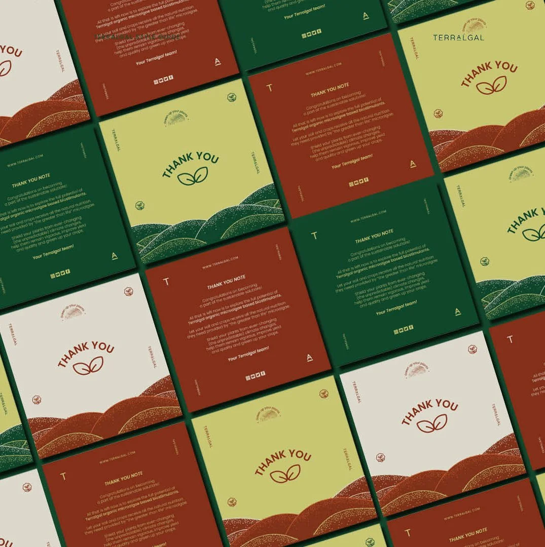
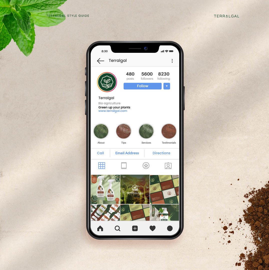
Clean, modern typography brings structure, while watercolor-style illustrations and dotted textures—evoking algae and fertile fields—introduce depth and tactility. The visuals that follow reflect Terralgal’s essence: an infusion of authenticity, organic warmth, and forward-looking innovation.
CREDITS:
Client: Terralgal Designer: Anamarija Leljak